Work / Autohaus Standard
Autohaus Standard
A dealership website redesign focused on vehicle presentation, trust, and an easier path to inquiry.
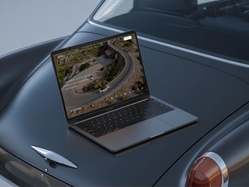
A dealership website redesign focused on vehicle presentation, trust, and an easier path to inquiry.
A website that presents cars the way the showroom does.
Autohaus Standard is a car dealership with experience in the trade since 1995. The redesign modernizes its website and improves how people discover vehicles.
Inventory, financing options, and dealership services are presented clearly and built to convert. Layout, hierarchy, and the presentation of each car got the most attention.
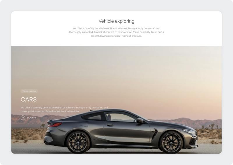
Hundreds of cars, and no clear way through them.
Listings, filters, price variations, financing information, and services. Without structure, a dealership site overwhelms.
Each listing has to show specifications, pricing, and photography clearly, and still feel premium.
Filtering had to let people narrow a large inventory quickly.
Pricing, vehicle condition, and services needed to read as clear and honest.
Every page also needed a strong call to action toward an inquiry, a booked appointment, or direct contact.
Inventory first, everything else around it.
I restructured the information architecture around vehicle inventory and key services.
Flows for the common actions: browsing vehicles, comparing models, and submitting an inquiry.
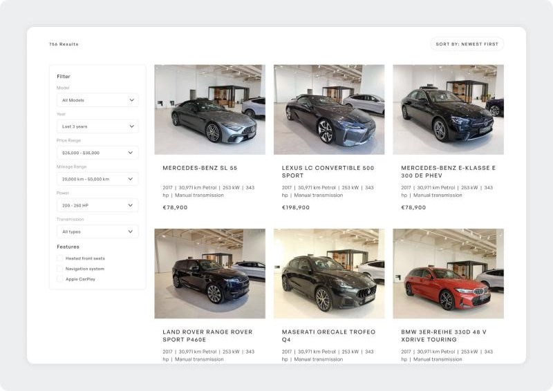
A clean vehicle card system with visible pricing and a specification breakdown, and simplified filtering.
Bold typography, structured spacing, and high-impact imagery for a premium feel, on desktop and mobile.
From a first look to an inquiry.
The site follows the way people shop for a car: look around, narrow down, check the details, get in touch. Each page hands over to the next one.
Quiet type, one green, and the cars in colour.
The interface steps back so the vehicles can lead: light type, generous white space, and thin dividers. One green carries the brand's own voice. Everything else on a page gets its colour from the photography.
Autohaus Standard
Make, model, price, first registration, mileage
A modern grotesk with a calm, confident tone that keeps prices and specifications easy to scan.
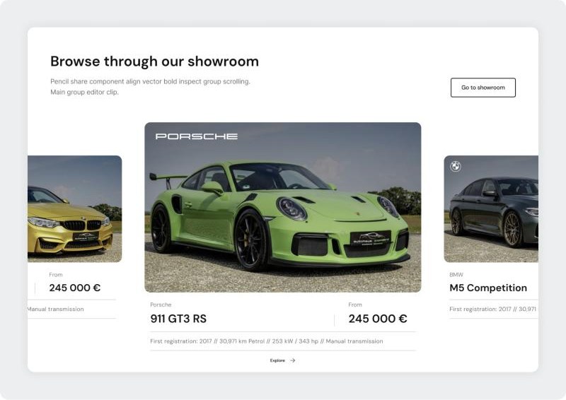
Featured vehicles sit in a carousel with the essentials under each photograph: make, model, price, first registration, mileage, power, and transmission.
Key features
The listing pairs a filter column with a three-column grid of vehicle cards. Every card repeats the same order of information, so comparing two cars takes a glance.
Key features
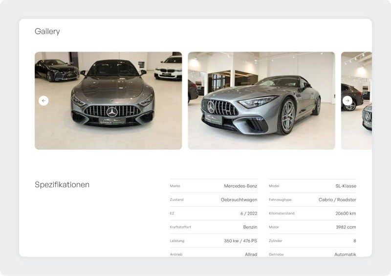
A vehicle page opens with a large gallery and continues with the specifications as a two-column table: make, model, condition, body type, mileage, engine, power, drivetrain, and gearbox.
Key features
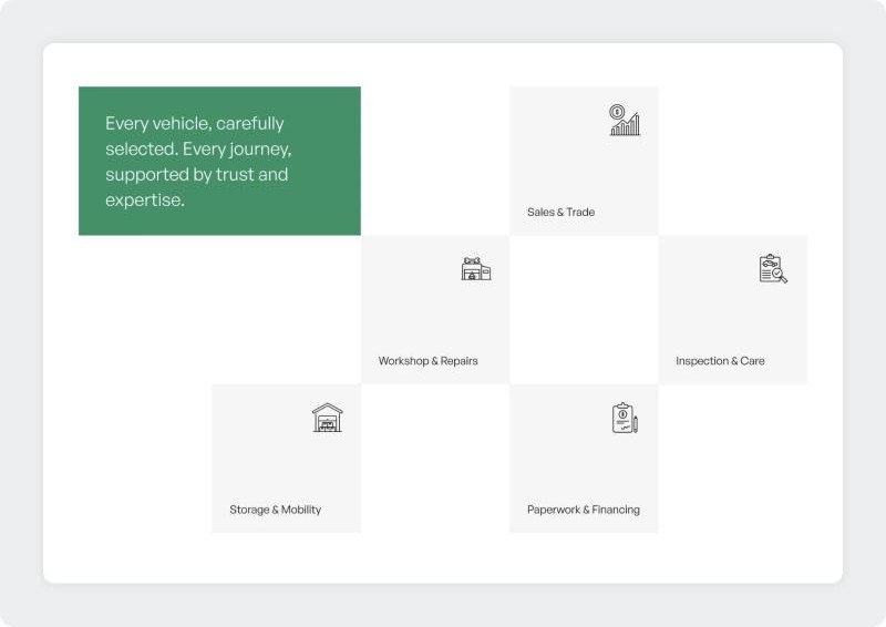
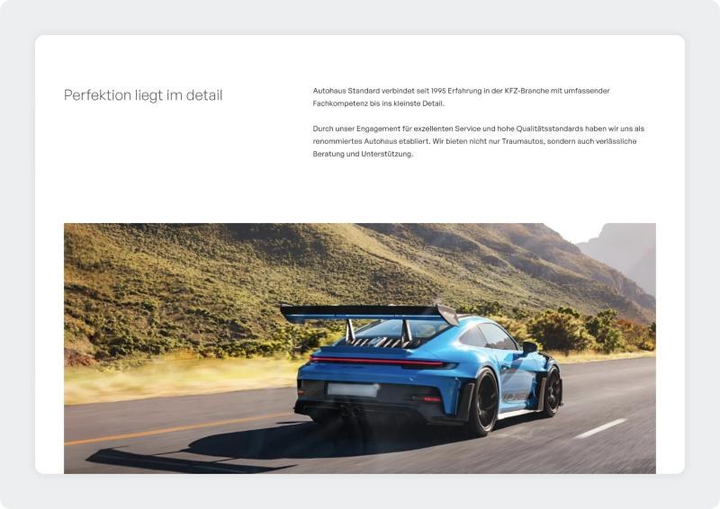
Five services are arranged as a loose grid around one statement in brand green, and the about page tells the dealership's story in two short paragraphs next to one strong photograph.
Key features
A next step on every page.
Contact buttons, financing inquiries, and booking options are integrated across the site, close to the vehicles they refer to. Responsive behavior was considered throughout, for consistent browsing on desktop and mobile.
Better presentation, and a shorter way to the inquiry.
The redesign presents vehicles better and makes a complex inventory simple to navigate.
There is a clear route from browsing to inquiry on every page.